swipefeed

swipefeed
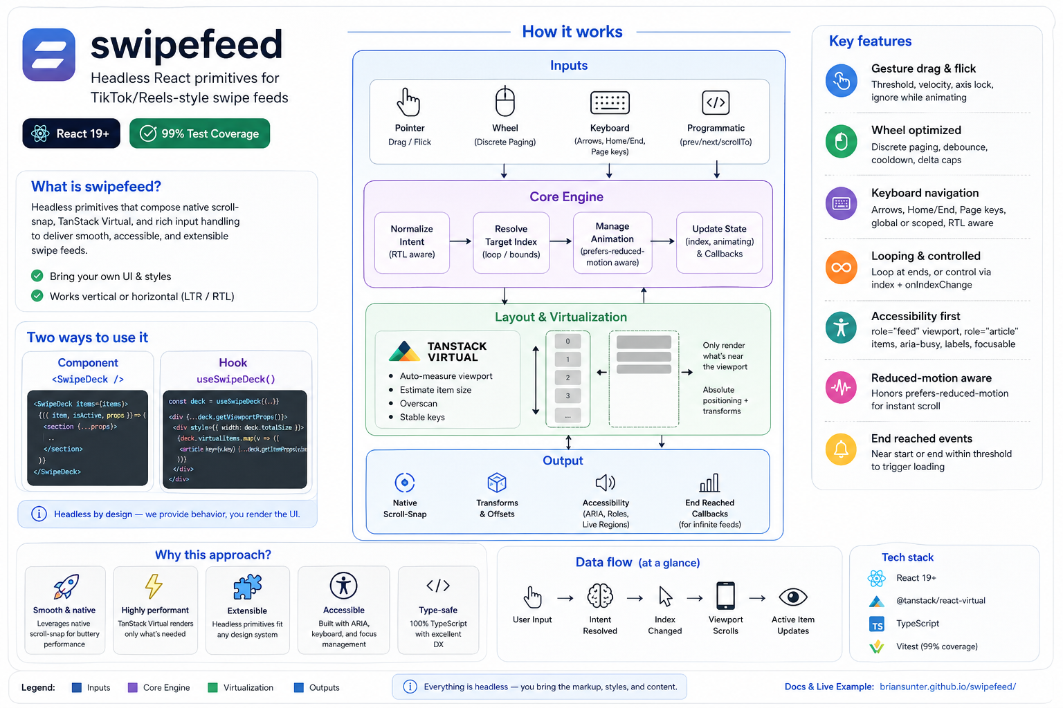
Headless React primitives for building TikTok/Reels-style swipe feeds. Ships a render-prop component (SwipeDeck) and a hook (useSwipeDeck) that wire up native scroll-snap, TanStack virtualization, gesture/wheel/keyboard inputs, accessibility, and programmatic controls.
Highlights
- Headless: bring your own markup/styles; spread provided props for behavior.
- Works vertically or horizontally with LTR/RTL awareness.
- Virtualization via
@tanstack/react-virtualwith auto measurement and overscan tuning. - Input support: pointer drag/flick, discrete wheel paging with heavy dampening, keyboard (global or scoped).
- Controlled or uncontrolled index, loopable navigation, programmatic
prev/next/scrollTo. - Accessibility-first: focusable
role="feed"viewport, per-itemrole="article",aria-label,aria-busy, snap alignment. - Reduced-motion aware (
prefers-reduced-motionuses instant scrolling). - End-reached callbacks for infinite loading triggers.
Installation
Using your preferred package manager:
bun add swipefeed
# or
npm install swipefeed
Peer dependencies: react@^19, react-dom@^19.
Quick start (component)
import { SwipeDeck } from "swipefeed";
function Feed({ items }) {
return (
<SwipeDeck items={items} className="w-full h-screen overflow-hidden">
{({ item, isActive, props }) => (
<section
{...props}
style={{ height: "100vh" }} // make each slide fill the viewport
>
<VideoPlayer video={item} playing={isActive} />
</section>
)}
</SwipeDeck>
);
}
Quick start (hook)
import { useSwipeDeck } from "swipefeed";
function CustomLayout({ items }) {
const deck = useSwipeDeck({ items, orientation: "horizontal", direction: "rtl" });
const viewportProps = deck.getViewportProps();
return (
<div {...viewportProps} style={{ ...viewportProps.style, height: "100vh" }}>
<div style={{ width: deck.totalSize, position: "relative" }}>
{deck.virtualItems.map((virtual) => {
const props = deck.getItemProps(virtual.index);
return (
<article key={virtual.key} {...props}>
{items[virtual.index].title}
</article>
);
})}
</div>
</div>
);
}
Styling essentials
- Give the viewport a fixed height/width (e.g.,
h-screen); items are absolutely positioned with transforms supplied bygetItemProps. - Native scroll-snap is applied for you; keep
overflow: autoon the viewport (default fromgetViewportProps). - For full-screen feeds, ensure
html, body, #rootstretch to 100%.
API reference
<SwipeDeck> props
Extends SwipeDeckOptions<T> plus:
as: custom element/component for the viewport (default"div").children(context): render prop; receives{ item, index, isActive, props }.className,style: forwarded to the viewport.ref: imperative handle (SwipeDeckHandle) withprev,next,scrollTo,getState.
SwipeDeckOptions<T>
items(required): readonly array of items.orientation:"vertical"(default) |"horizontal".direction:"ltr"(default) |"rtl"(affects horizontal gestures/wheel/keyboard).defaultIndex: initial index for uncontrolled mode (default0).index: controlled index. When set, you must manage updates viaonIndexChange.onIndexChange(index, source): fires on any navigation.sourceis one of"user:gesture" | "user:wheel" | "user:keyboard" | "programmatic" | "snap".loop: wrap navigation at ends (defaultfalse).gesture:{ threshold, flickVelocity, lockAxis, ignoreWhileAnimating }(defaults10,0.1,true,true).wheel:{ discretePaging, threshold, debounce, cooldown }(defaultstrue,100,120ms,800ms) with aggressive dampening to prevent multi-item jumps.keyboard:{ enabled, global, bindings }(default enabled, scoped to viewport). Bindings default to arrows + Home/End + Page keys; RTL flips horizontal intent.keyboardNavigation: boolean shorthand to disable keyboard entirely (defaulttrue).virtual:{ overscan, estimatedSize, getItemKey }(defaults5, auto-measured viewport size,indexkey). Backed by@tanstack/react-virtual.endReachedThreshold: number of items from ends to triggeronEndReached(default3).onEndReached({ distanceFromEnd, direction }): called when within threshold from start or end.ariaLabel: label for the feed (default"Swipe feed").visibility: reserved for future visibility strategies (currently unused).onItemActive,onItemInactive: reserved hooks for future activation callbacks (currently no-ops).
Render context (children)
item: the data item.index: item index.isActive: whether the item is currently centered/active.props: spread onto your item element (includes refs, transforms, snap styles, data attributes).
Imperative handle (SwipeDeckHandle)
prev(),next()scrollTo(index, { behavior })getState():{ index, isAnimating, canPrev, canNext }
useSwipeDeck return shape
- State:
index,isAnimating,canPrev,canNext,items,orientation. - Actions:
prev(),next(),scrollTo(index, { behavior }). - Layout:
virtualItems(offset/size/key/measureElement),totalSize. - Props helpers:
getViewportProps(),getItemProps(index).
Helper hook
useWindowSize(): throttled window dimensions{ width, height }.
Virtualization behavior
- Always uses
@tanstack/react-virtualunder the hood for consistent offsets, even for small lists. - If
virtual.estimatedSizeis omitted, the viewport is measured viaResizeObserverand used as the estimate, keeping slides at viewport size by default. virtual.getItemKeylets you provide stable keys (otherwise the index is used).virtual.overscantunes how many items render around the viewport (default5).
Input handling
- Gestures: pointer drag + flick with threshold/velocity detection, axis locking, and optional ignore-during-animation.
- Wheel: discrete paging with direction locking, debounce, cooldown, and delta caps to prevent multi-item jumps on trackpads.
- Keyboard: arrow/Home/End/PageUp/PageDown; can be global or scoped to the viewport; RTL-aware for horizontal decks.
- Programmatic:
scrollTochoosessmoothvsinstantbased onprefers-reduced-motion, and temporarily disables snap while animating to avoid fights with CSS snap.
Accessibility
- Viewport:
role="feed",aria-label,aria-busywhile animating, focusable (tabIndex=0), native scroll-snap,touch-actionset per axis. - Items:
role="article"witharia-labelthat includes index/length; snap alignment applied on each item. - RTL-aware keyboard/wheel for horizontal feeds.
End reached & looping
onEndReachedfires both near the start and near the end when withinendReachedThresholditems.loopwraps navigation for gestures, wheel, keyboard, and programmatic calls.
Example app
A TikTok-style vertical feed using YouTube iframes lives in example/.
bun install # installs root + workspace deps
bun run build # optional: build the library once
cd example
bun run dev # starts Vite on http://localhost:5173
Key bits: render prop usage, global keyboard navigation, gesture swipe, mute button overlay, and custom chrome.
Scripts (root)
bun run build– bundlesrc/todist/with sourcemaps.bun run docs:api– generate markdown API docs indocs/api.bun run docs:site– generate HTML TypeDoc site tosite/docs(default theme).bun run example:build:site– build the Vite example withbase=/example/.bun run site:prepare– rebuild docs+example intosite/for GitHub Pages.bun run test– Vitest (jsdom) unit suite.bun run test:browser– Vitest browser runner (wheel/scroll integration).bun run test:coverage,bun run test:browser:coverage,bun run coverage:merge– coverage reports/merge.bun run lint/bun run format– Biome lint/format.bun run typecheck– TypeScript.bun run storybook/bun run storybook:build– Storybook dev/build.
GitHub Pages (docs + example)
- Build locally:
bun run site:prepare(producessite/docsfor API HTML,site/examplefor the Vite demo). - Deploy via CI: push to
masterand the Pages workflow builds both sections and publishessite/to thegh-pagesbranch (docs at/docs/, example at/swipefeed/example/by default). - If you fork/rename the repo or use a custom Pages root, set
VITE_BASE=/<your-repo>/example/when runningexample:build:siteor adjust the workflow accordingly.
Notes & limitations
visibility,onItemActive, andonItemInactiveoptions are present for future parity with the design spec but are not wired yet.- Ensure your viewport has a defined size; virtualization and snap rely on it.